
RESPONSIVE WEB DESIGN
Brooks Running is a market leader in performance running shoes. I was hired onto the Purchase Confidence fusion team to optimize checkout usability. This includes reducing the average checkout time, improving drop-off rates, and simplifying steps that create friction. From the preliminary analysis we’ve done, a new checkout experience was created to address these points of friction.
I was the sole UX Designer in the Purchase Confidence fusion team. The team included myself, a senior project manager, technical project manager, 2 business analysts, and a remote team of developers.
The Problem
A competitive analysis showed that brooksrunning.com (BR.com) has a longer average checkout time (85 seconds) compared to other brands like Asics (75 seconds) and On Running (70 seconds). Customers also experience significant friction in steps such as log-in/account creation, address, payment entry, and order review.
Objectives
In order to reduce abandonment and increase checkout completion, we've identify opportunities to streamline and enhance the user experience. This includes:
Removing the interstitial login screen before the checkout screen
Encourage sign-in/sign-up for account as part of checkout
Reducing the number of steps from 4 to 3
Update the shipping step to combine shipping info and shipping method
Allow registered users to checkout with one click by filling in fields with pre-saved shipping and payment information
Surface express checkout options like ApplePay and PayPal
Decrease friction with address fields in particular
Removing the Interstitial Login Screen
Why? In the US, 70% of checkout visits start in a guest state. Those users first land on the account-login page. There's currently a 26% dropoff rate at this step. The login screen is a significant point of friction since customers just want to proceed to checkout without a step in between.
Additionally, 26% of those login, 14% create an account, and the rest continue as guests. By removing the login page and moving the Email field from the third step to the first step, I believe that we will see an improvement in dropoff rates and also make account creation easier.
Impact. Internal testing showed the reduction of login screen dropoff by 10% translates to $3.6 million annually for the US and €714,000 anually for EMEA.


Shown here is the old interstitial login screen where 26% of users abandon the checkout process.

Step 1 of the new checkout flow will be an email field which recognizes whether or not the customer has a Brooks Run Club (BRC) account.

If the email is not a registered BRC account then it will ask to continue as a guest or sign up.
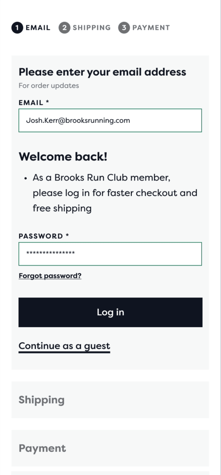
If the email is associated with a BRC account then a customer can login for free shipping and faster checkout with saved information.
Surfacing Express Checkout Options
Why? After doing an internal UX audit of the Brooks Running website, I discovered both Baymard Institute and Nielson Normal Group now treat express checkout as table stakes for competitive e-commerce UX, particularly in mobile-first categories like athletic shoes and apparel. On iOS devices in the US, ApplePay makes up ~30% of orders. The UX question has shifted from "Should we offer express checkout" to "How prominently and intelligently do we integrate" This also helps solve our current issue of BR.com's checkout process having a significantly longer average checkout time than our competitors.
Additionally, 26% of those login, 14% create an account, and the rest continue as guests. By removing the login page and moving the Email field from the third step to the first step, I believe that we will see an improvement in dropoff rates and also make account creation easier.
Impact. Internal testing showed the reduction of login screen dropoff by 10% translates to $3.6 million annually for the US and €714,000 anually for EMEA.
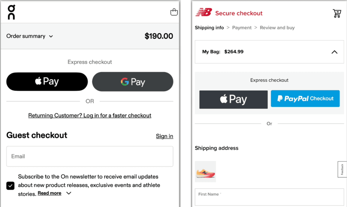
This allows BR.com to stay in line with competitors like Nike and New Balance, who already have express checkout options at the top of their checkout flow.

At the start of the checkout process, customers will now see a section called "Express Checkout" along with two buttons for PayPal and ApplePay.

Selecting ApplePay will open up an overlay where their payment, contact information, and shipping information are already stored.

After paying, the customer will see an order confirmation screen with their estimated delivery date, order number, payment details, and an option to create an account if they didn't already.
Simplifying Checkout By Reducing The Number of Steps to 3
Why? A competitive analysis with a small group of participants showed that Brooks Running was among the highest in terms of average checkout time. We were tied with Nike with an average checkout time of 85 seconds. Others that did not have a final review step had an average checkout time of around 70 seconds. Internal testing showed that removing the review step can have 5% less drop-offs
Impact. Internal testing showed that removing the review step can have 5% less drop-offs, which translates to $2.3 million annually for the US. In a usability study, 80% of users either didn't notice the review step was missing, or were fine with it being removed.

Competitors like On, Hoka, and Asics have payment as their last step, which leads to a shorter average checkout time.

Shown here is the old checkout flow with 4 steps: Shipping address, Shipping method, Payment, and Review.
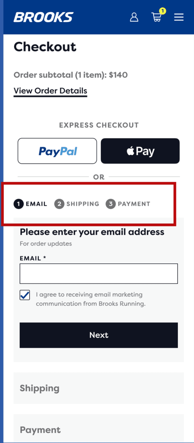
Steps will be reduced from 4 to 1. Email will now be the first step.

Step 2 will combine Shipping Address and Shipping Method.

Payment will be the final step, Customers can review their order information by scrolling up.